Ahava Dead Sea Osmoter Collection:
Case Study

Role: Design / Production
Ahava is a beauty company headquartered in Israel, with a product-focus on the mud and minerals from the Dead Sea.
Process
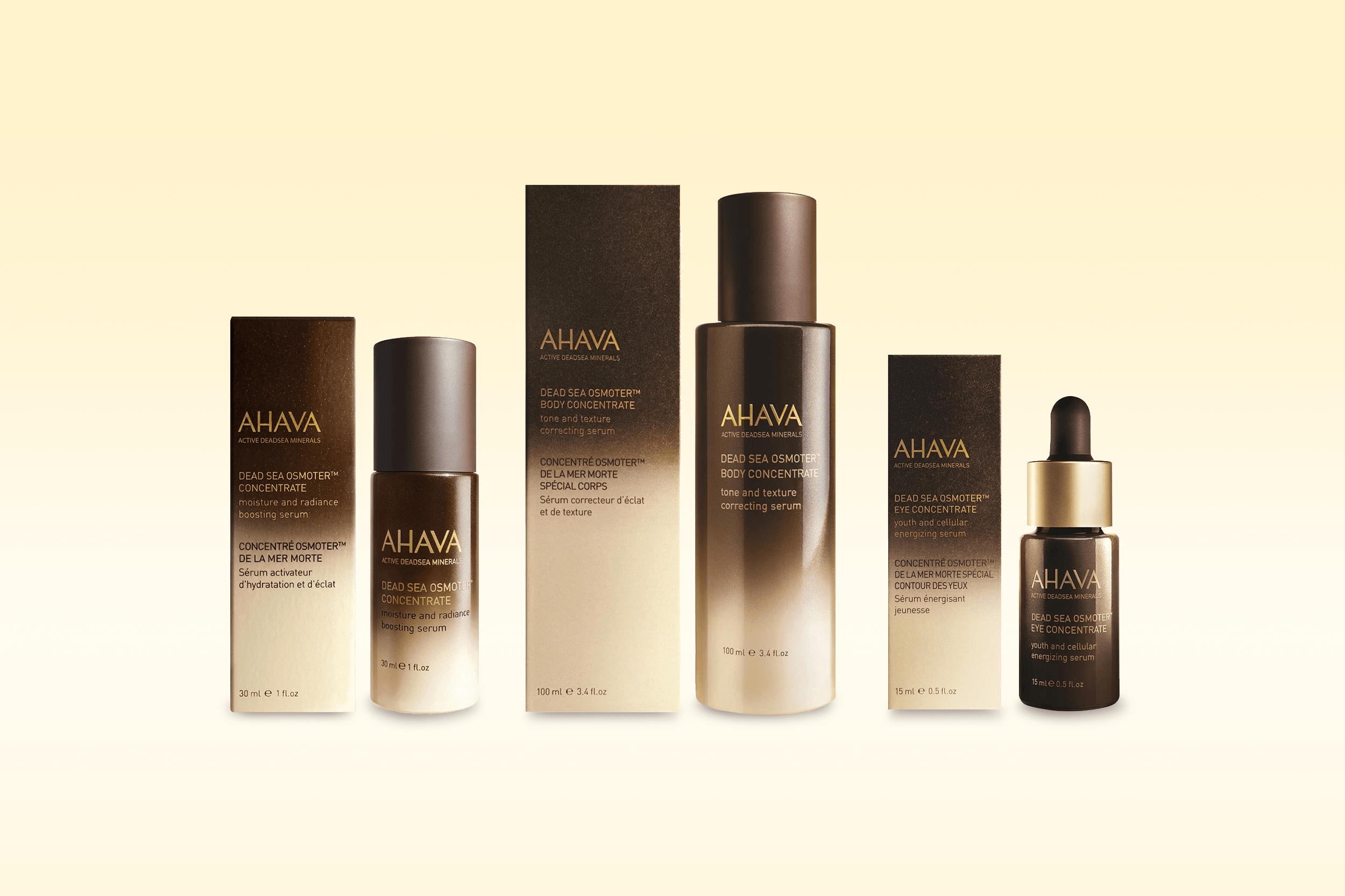
Brief: Create a prestige hero product category to stand out on shelf within an existing core line up of cream-colored packaging.
The 30 ml serum for face was the first product that launched, followed by the creation of the body serum and eye serum.
The gradation of color indicates a transition from the core packaging (cream) to something new (chocolate brown). It also implies “radiance” which is one of the key benefits of the product. A pearlized finish was included to further convey radiance and luxury. I traveled to the glass bottle manufacturer in China to create color standards.
Dead Sea Osmoter Concentrate was the #1 selling product upon launch and continues to be one of Ahava’s top sellers.

Sampling of Ahava core packaging

Ad creative direction: Air Paris Agency